How to think visually using visual analogies
Visual thinking is defined as an active, intelligent process of perception that facilitates the identification of patterns, the externalization of complex mental models, and the resolution of intricate problems through structural mapping and analogical reasoning.
Perception According to Rudolf Arnheim that the pursuit of logic and rationality is not exclusive to verbal or numerical domains; rather, perception itself involves cognitive operations identical to those in theoretical thinking.
Perception, in this framework, is an active process of organization. The mind does not simply record external stimuli but intelligently selects and interprets them. Arnheim posits that all perceiving is also thinking, all reasoning is also intuition, and all observation is also invention. This “intelligence of perception” is manifested in the ability to discern patterns, reorganize visual stimuli, and extract the essence of an object—a process referred to as synthesizing the concept in its simplest form
A Taxonomy of Visual Analogies by Anna Vital
Anna Vital’s framework of 72 visual analogies serves as an exhaustive guide for this process, grouping tools into charts, abstract analogies, functional analogies, and complex allegories
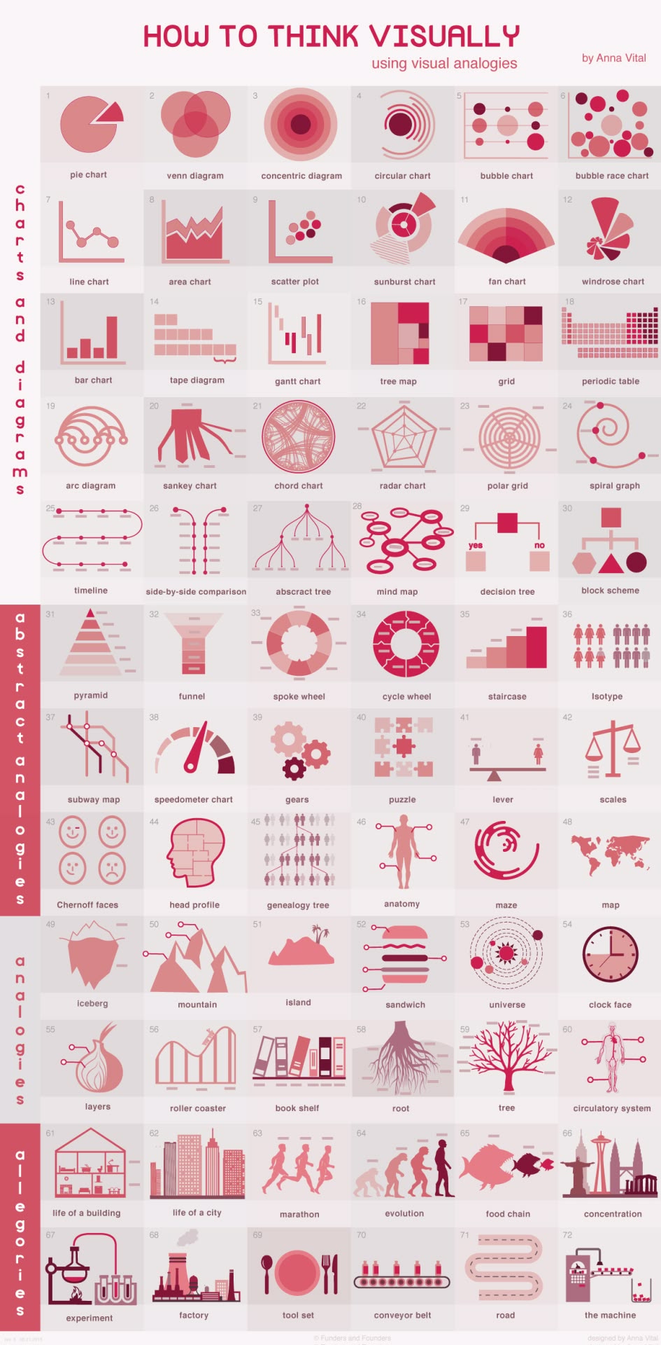
Charts and diagrams
| No. | Chart/Diagram | Description and Use Case |
|---|---|---|
| 1 | Pie Chart | A popular but often criticized tool best used for simple two-segment comparisons to avoid eye-fatigue when comparing circle segments. |
| 2 | Venn Diagram | Illustrates the overlap of two to three items; effective for showing the existence of relationships rather than precise data amounts. |
| 3 | Concentric Diagram | An “onion-like” structure where the most important purpose is in the center and importance decreases in outward layers. |
| 4 | Circular Chart | Compares lengths relative to a 100% whole; ideal for schedules and lifespans. |
| 5 | Bubble Chart | Facilitates rough comparisons of quantities, especially effective for data varying by orders of magnitude like budgets or planet sizes. |
| 6 | Bubble Race Chart | Assigns meaning to the position of bubbles on axes (e.g., y-axis for education, x-axis for lifespan) to show macro trends. |
| 7 | Line Chart | A series of points connected by lines showing how something changes over time; versatile but highly abstract. |
| 8 | Area Chart | Fills the space below line charts with color to emphasize trend comparisons and volume. |
| 9 | Scatter Plot | Identifying clusters and outliers in data, where the density of points grabs the viewer’s attention. |
| 10 | Sunburst Chart | A multi-level pie chart where the distance from the center represents a hierarchical or chronological relationship. |
| 11 | Fan Chart | Used for genealogy or the evolution of ideas where the number of items doubles moving outward from the center. |
| 12 | Windrose Chart | Illustrates how much of a specific variable is distributed across different directions. |
| 13 | Bar Chart | Represents numbers through bar length; superior to bubble charts for showing exact values. |
| 14 | Tape Diagram | Shows ratios by treating the visual as a measuring tape that can be sectioned with icons for semantic meaning. |
| 15 | Gantt Chart | Visualizes stretches of time and their relative positions, often used for project scheduling and historical intervals. |
| 16 | Tree Map | Uses nested rectangles to display hierarchical data, allowing categories to be divided into visible sub-sections. |
| 17 | Grid | A system for arranging equal units to show order without establishing a hierarchy. |
| 18 | Periodic Table | A specialized grid where the column or row position carries specific meaning, such as chemical reactivity. |
| 19 | Arc Diagram | A one-dimensional diagram showing interactions between nodes, useful for revealing patterns in collaborations. |
| 20 | Sankey Chart | Modeled after a river, where the thickness of splitting lines represents flow quantities and distribution. |
| 21 | Chord Chart | A circular interaction diagram where line thickness indicates the strength of relationships between nodes. |
| 22 | Radar Chart | Spokes show numbers for rough comparisons of components or ingredients that form a whole. |
| 23 | Polar Grid | Similar to a radar chart but allows for more spokes to compare subtle characteristics, such as flavor profiles. |
| 24 | Spiral Graph | Shows a time sequence where events closer to the present are positioned furthest from the center. |
| 25 | Timeline | A spiral time sequence that prompts the eye to follow a continuous narrative (e.g., biographies). |
| 26 | Side-by-side comparison | Parallel lines with specific points itemizing differences between two distinct subjects. |
| 27 | Abstract Tree | Represents hierarchies and groupings where any concept with sub-types can be branched out. |
| 28 | Mind Map | A non-linear tool where any number of unrelated things can be connected to show the flow of logic. |
| 29 | Decision Tree | Maps the flow of choices where specific node shapes indicate the type of information or decision point. |
| 30 | Block Scheme (Flowchart) | Visualizes algorithms or solutions using standardized shapes (e.g., diamonds for decisions, rectangles for processes). |
Abstracts analogies
| No. | Analogy | Description and Use Case |
|---|---|---|
| 31 | Pyramid | Represents a hierarchy where upper layers are progressively smaller. Ideal for power distribution, social classes, nutritional values, or Maslow’s hierarchy of needs. |
| 32 | Funnel | The reverse of a pyramid; visualizes selection stages where many options are narrowed down, such as customer conversion or sales funnels. |
| 33 | Spoke wheel | Shows equal parts of a whole where all members support a central core and their specific order is irrelevant (e.g., donors or types of theories). |
| 34 | Cycle wheel | Focuses on never-ending cycles and circular cause-and-effect relationships, such as investor sentiment or the “chicken and egg” paradox. |
| 35 | Staircase | Emphasizes the number and difficulty of steps needed to achieve a goal, allowing for the comparison of different progression paths. |
| 36 | Isotype | A visual language that shows quantity through the number of icons used rather than scaling a single object’s size. |
| 37 | Subway map | Visualizes how different routes or lines of thought intersect at various “stops.” Useful for research objectives, theories, or biological transport. |
| 38 | Speedometer chart | Illustrates a value’s position across a spectrum, such as moving from slow to fast or from safe to dangerous. |
| 39 | Gears | Represents leverage and impact; illustrates how a small initial action or favor can set much larger results in motion. |
| 40 | Puzzle | Shows how irregular, seemingly misfit pieces can fit perfectly together; used to emphasize collaboration and synergy. |
| 41 | Lever | Depicts how a small element can balance or outweigh a larger one, making it effective for negotiation strategies or underdog trends. |
| 42 | Scales | Used to weigh factors during decision-making, commonly representing justice, balance of power, or the comparison of pros and cons. |
| 43 | Chernoff faces | Encodes data into human facial features (eyes, mouth, etc.) to translate complex metrics into recognizable sentiments or motives. |
| 44 | Head profile | Visualizes thought compartments and interconnections within a person or a collective entity to show where different ideas reside. |
| 45 | Genealogy tree | A specialized tree used to help trace lineage, product succession, or the historical evolution of specific ideas. |
| 46 | Anatomy | Breaks down the specific parts of a person or object to explain what each component does (e.g., “the anatomy of an entrepreneur”). |
| 47 | Maze | Highlights the complexity and tangled paths involved in reaching a solution, useful for comparing difficult strategies or policies. |
| 48 | Map | Uses figurative lands and oceans to represent complex abstract worlds, such as mapping out the landscape of the Internet. |
True Analogies
| # | Analogy | Description and Use Case |
|---|---|---|
| 49 | Iceberg | Shows that the visible part of a concept is much smaller than the hidden foundation. Used for describing success, effort, and SEO strategies. |
| 50 | Mountain | Represents a challenge where progress is an upward climb. Used to visualize perseverance, steep learning curves, or reaching a peak goal. |
| 51 | Island | Displays an isolated process with clear boundaries but internal complexity. Used for sub-cultures, specific corporations, or city life. |
| 52 | Sandwich | Features multi-layered components spread apart to reveal the ""innards."" Used for buildings (architectural cross-sections), soil layers, or complex machinery. |
| 53 | Universe | Describes things revolving around a central force without a visible connection. Used to show how people gravitate toward ideas or startup funding rounds. |
| 54 | Clock Face | Uses the familiar 12-hour cycle to divide time into discrete parts. Used for daily routines, peak activity hours, or author sleep schedules. |
| 55 | Layers | Levels that can be ""peeled off"" to reach a core truth. Used for budget investigations, excuses, or the components of a water budget. |
| 56 | Roller Coaster | Emphasizes rapid shifts between ""highs"" and ""lows."" Used for entrepreneurship, creative work, parenting, and emotional cycles. |
| 57 | Book Shelf | Uses book size to represent volume and order to represent priority. Used for reading statistics or organizing categories of information. |
| 58 | Root | Shows how an idea or entity takes hold and spreads from a base. Used for problem-solving, immigration, or the spread of viruses. |
| 59 | Tree | Illustrates a central trunk splitting into smaller branches. Used for knowledge systems, the evolution of species, and the spread of ideas. |
| 60 | Circulatory System | Shows movement from a ""heart"" to the outskirts and back. Used for transportation systems, supply chains, and urban connectivity. |
Allegories
| # | Allegory | Description and Use Case |
|---|---|---|
| 61 | Road | Shows a journey where the path itself—curves, straightaways, and dead ends—represents progress. Used for biographies, company history, or process stages. |
| 62 | Bridge | Connects two different states or ideas. Used for transitions, overcoming obstacles, or linking a problem to a solution. |
| 63 | Funnel | Shows a wide intake narrowing down to a single outcome. Used for sales processes, decision-making, or filtering information. |
| 64 | Ladder | Represents a step-by-step ascent where each rung is a milestone. Used for career growth, skill acquisition, or social mobility. |
| 65 | Stairs | Similar to a ladder but implies a more stable, architectural progression. Used for educational levels, legal processes, or building a foundation. |
| 66 | Mountain Range | A series of peaks and valleys representing recurring challenges. Used for economic cycles, multiple project phases, or life’s ups and downs. |
| 67 | Pipeline | Shows a continuous flow from start to finish with possible leaks or blocks. Used for supply chains, product development, or content distribution. |
| 68 | Conveyor Belt | Represents a repetitive, automated process where items are added at stages. Used for manufacturing, habit formation, or routine tasks. |
| 69 | Waterfall | A top-down flow where each stage feeds the next. Used for cascading effects, traditional project management, or wealth distribution. |
| 70 | Castle | Represents protection, layers of security, or a final achievement. Used for cybersecurity, wealth preservation, or defensive strategies. |
How to find the best visual analogy?
This blog suggests the following 5 princples:
- It looks familiar to most of people
- It has a structure
- It matches your narrative’s structure
- It is visible (something that can be seen)
- It is visual (something that is easy to see)
A good visual analogy is something is a familiar physical object (or with a structure) that matches your narrative’s structure. Objects with fewer details are more familiar – because most people don’t look for detail. However if you take out all the details you are left with pure abstractions i.e. graphs and charts. A reader is emotionally attached to detail and they find meaning in familiar objects.